Pittsburgh’s Premiere Fitness Center
Oxford Athletic Club - Wexford, PA
OXFORD ATHLETIC CLUB REBRAND
Role: Design & Visual Media Coordinator
Timeline: March 2025 - March 2026
Team: Marketing, Executive Leadership, Department Managers
Collaborators: Erin M, Marissa S
Services: Brand Identity, Print Design, Digital Marketing
Tools: Illustrator, InDesign, Canva, Mailchimp
Deliverables:
Brand Strategy
Visual Identity System
Brand Standards Guide
100+ Marketing Assets
Employee Brand Training
Brand Ambassador Program
Social, Web, Print & Environmental Graphics
-
Oxford Athletic Club had experienced multiple leadership and marketing transitions, including shifts between outsourced and in-house marketing. As a result, the brand lacked consistency, strategic direction, and a clearly defined identity. Marketing efforts had become primarily sales-driven, making it difficult to communicate the club's long-term value and differentiate it from competitors.
The goal of the rebrand was to modernize the brand while preserving its legacy, creating a cohesive visual identity that reflected Oxford's values, strengthened its promise to the community, and delivered a consistent member experience across every touchpoint.
-
Before making visual decisions, I worked to establish internal alignment around the importance of branding, not just as a logo, but as a tool for shaping perception, communicating values, and creating meaningful member experiences.
To develop the new brand identity, I conducted extensive research, including:
Competitive analysis of Newtown Athletic Club, Equinox, and Chelsea Piers
Industry trend research within the wellness and fitness space
Member and employee feedback through focus groups
Evaluation of cultural and design trends influencing modern wellness brands
Once the strategy was established, I developed brand standards and trained employees to ensure the new identity was consistently represented across departments.
-
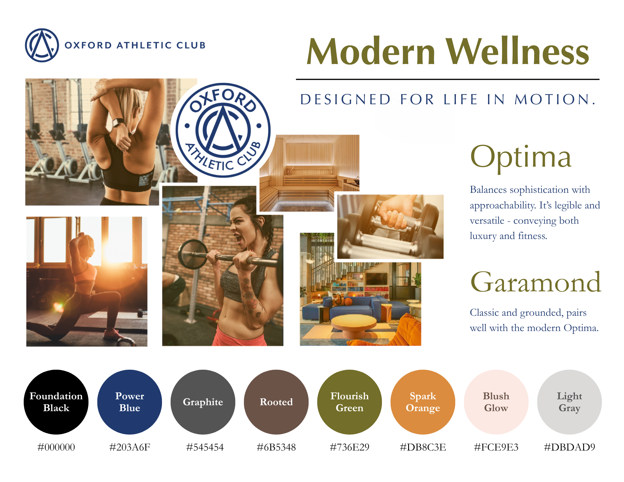
The visual identity was built around Oxford's core values and the concept of Modern Wellness: creating a brand that felt welcoming, aspirational, and authentic.
Color Palette
The palette draws inspiration from natural materials like wood and stone, reflecting wellness, stability, and personal growth.
Power Blue — Strength, trust, and confidence
Graphite — Stability, integrity, and sophistication
Rooted — Natural wellness and connection
Flourish Green — Growth, transformation, and progress
Spark Orange — Energy, motivation, and creativity
Blush Glow — Warmth, inclusivity, and approachability
Typography & Imagery
Photography emphasizes natural light, authentic interactions, and moments of rejuvenation rather than staged fitness imagery. The goal was to showcase the club as a lifestyle destination where wellness extends beyond exercise.
Typography and supporting graphics reinforce a clean, modern aesthetic while remaining approachable and timeless.
Logo
Rather than redesigning the logo, I chose to retain it because it continued to communicate the club's identity effectively. Instead, I modernized the surrounding visual system, allowing the refreshed brand to feel current while maintaining existing brand recognition.
Iconography
A custom icon system was created to visually reinforce Oxford's core values and improve consistency across marketing materials and member communications.
-
The rebrand established a cohesive visual identity that strengthened Oxford Athletic Club's presence across every member touchpoint. I created 100+ branded assets spanning digital and print, including social media, the website, signage, email marketing, apparel, and in-club collateral, ensuring a consistent brand experience across all platforms.
To support long-term adoption, I trained more than 200 employees on the new brand standards, helping teams understand not only how to apply the visual identity but also how to communicate the brand consistently. I also helped develop and launch a Brand Ambassador Program, beginning with 15 employee ambassadors who championed the brand internally and helped reinforce Oxford's culture and values.
This project strengthened my ability to lead a large-scale branding initiative from research through implementation, balancing stakeholder feedback, building organizational buy-in, and translating business goals into a cohesive visual identity that unified the organization and elevated the member experience.
Final Brand In Use
Brand Vision Board
Instagram Vision Mock Up
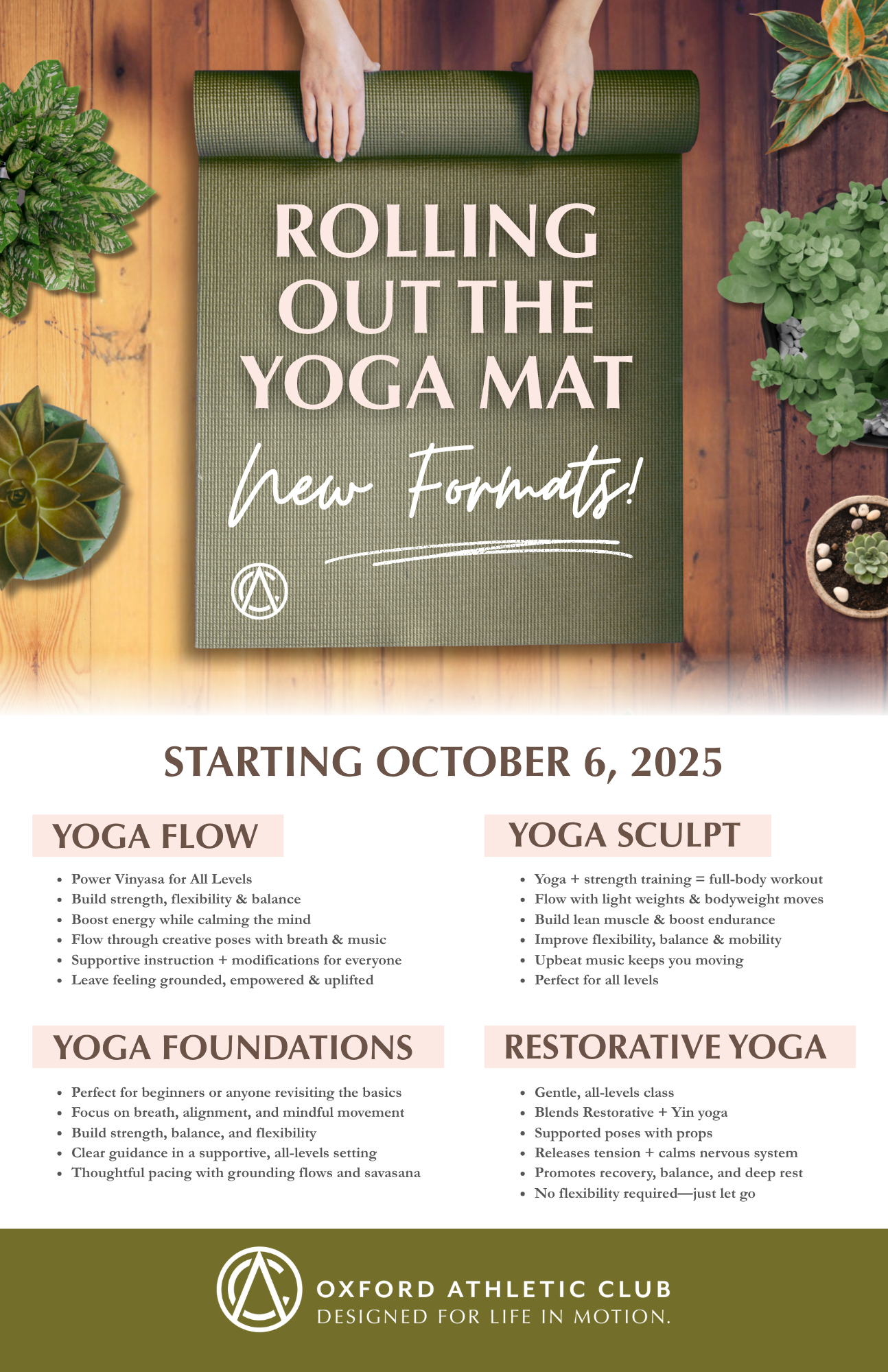
Yoga Offerings Flyer
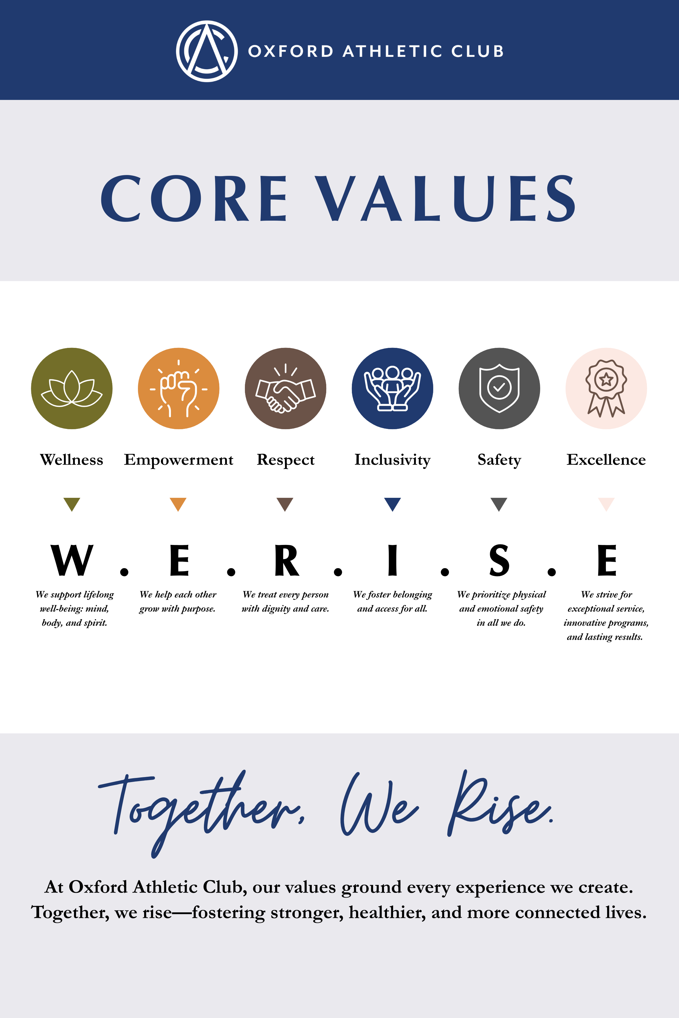
Easel Sign
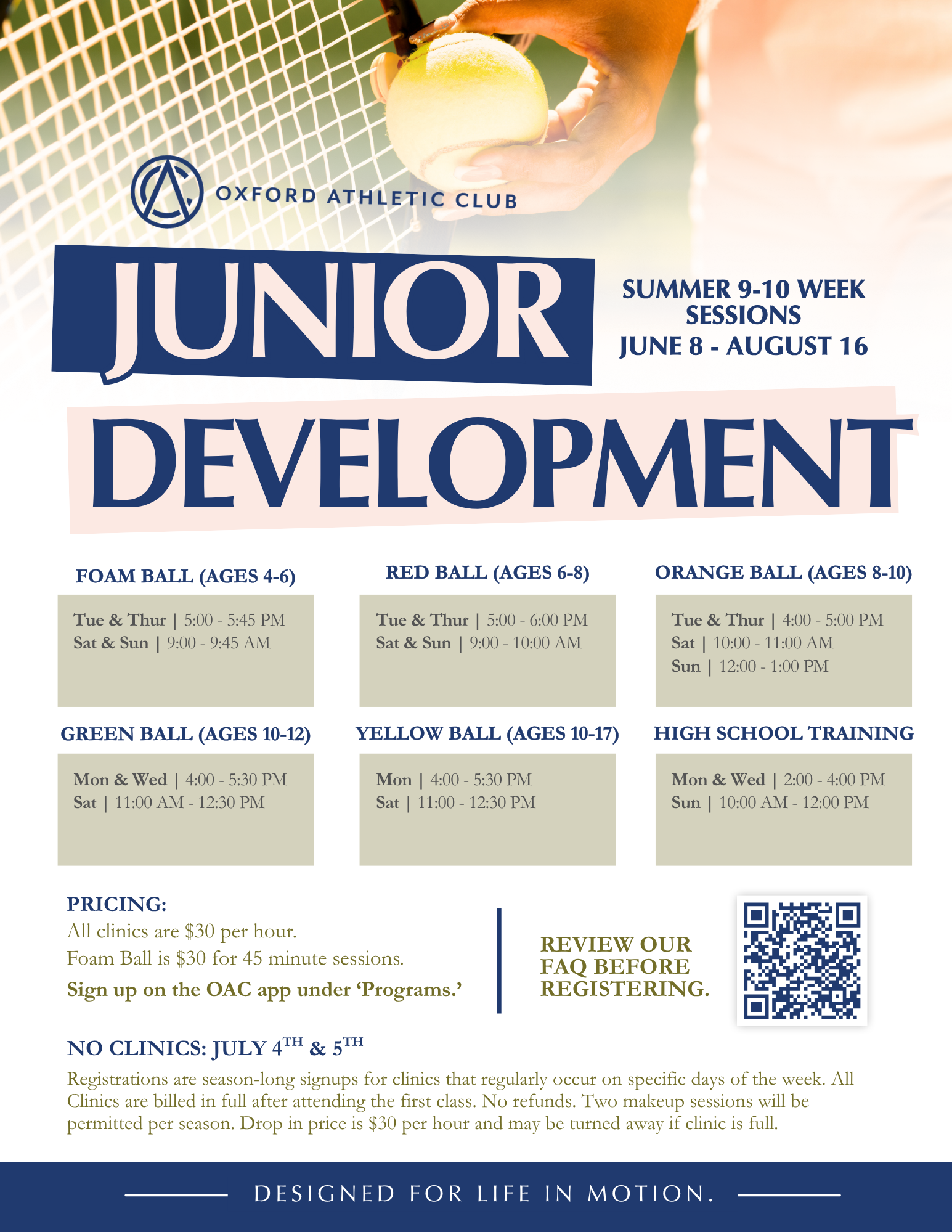
Junior Development Flyer
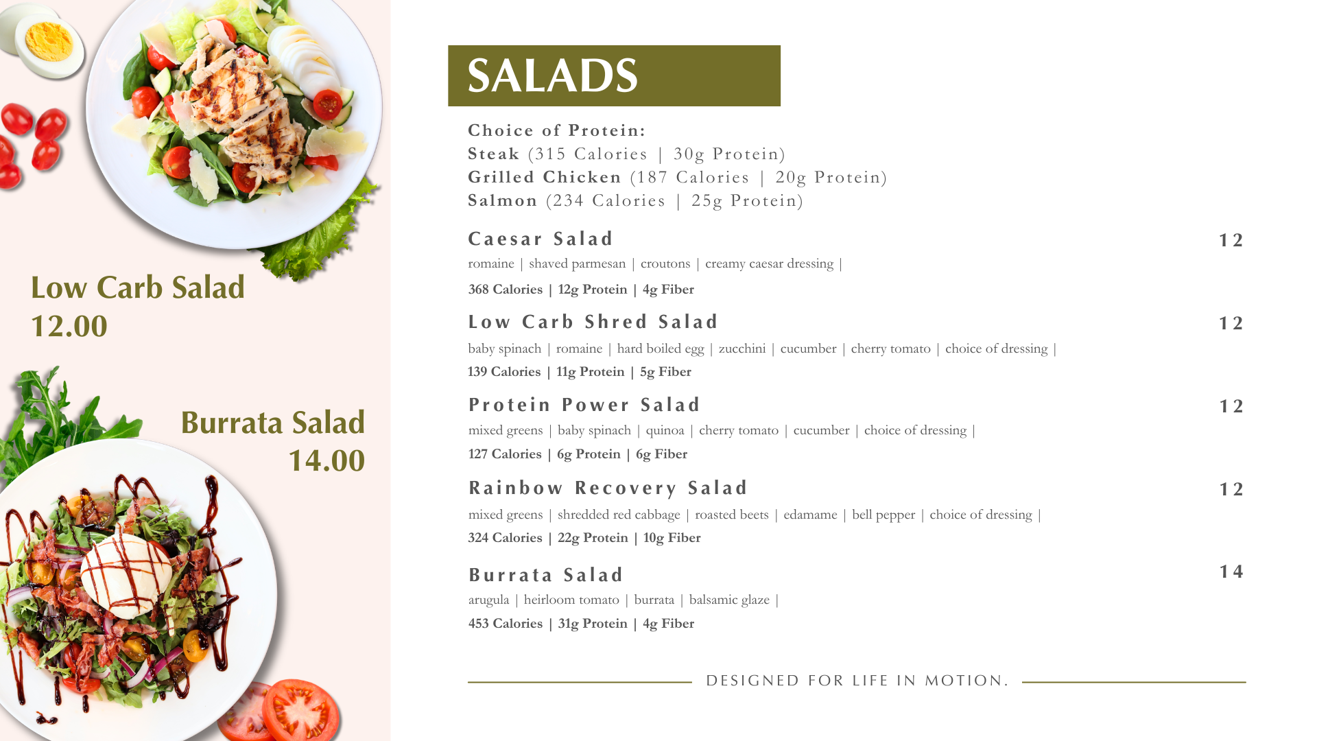
Cafe Digital Menu Screen
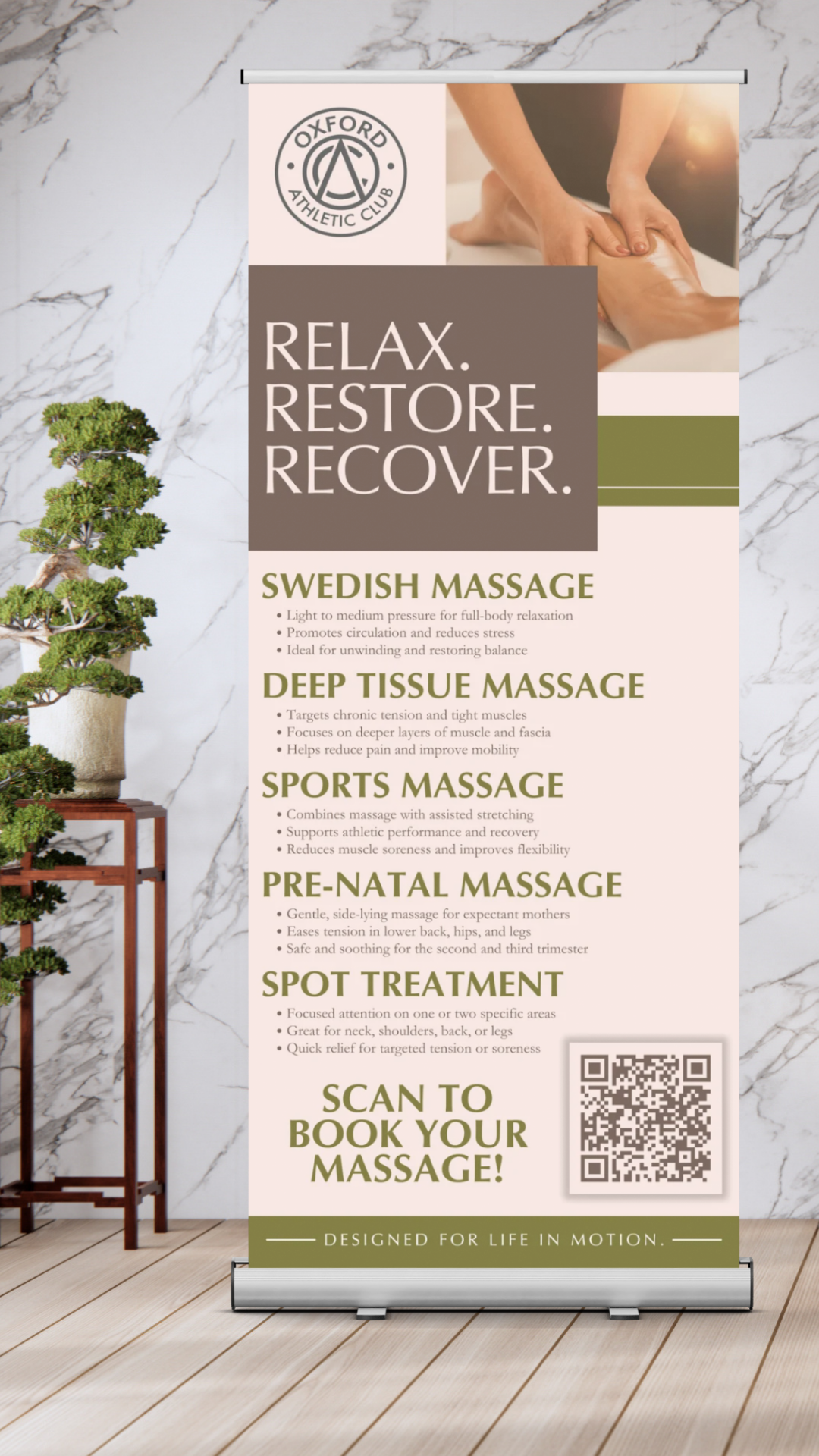
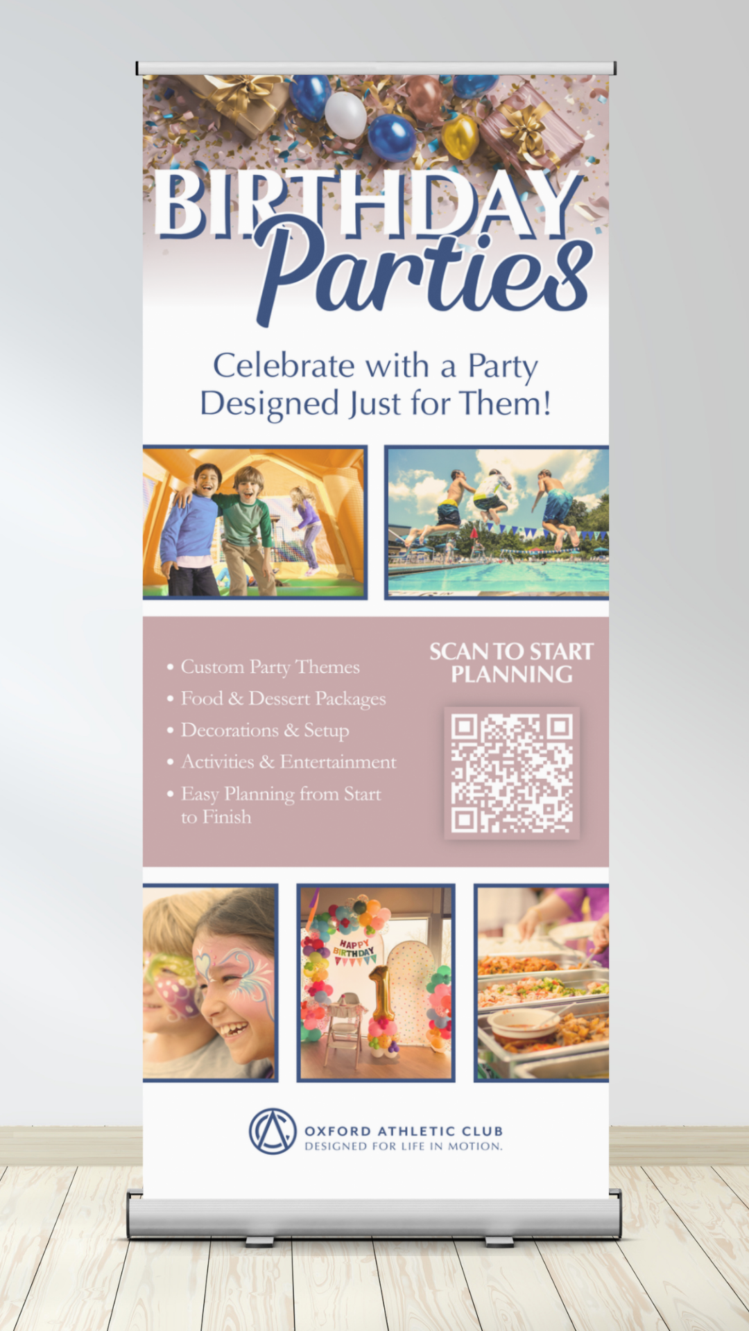
Retractable Banners